15 Pet Boutique Design Tricks the Pros Use to Make Shoppers Stop, Stare, and Spend
I still remember the first time I walked into a pet boutique that made me go “wow” out loud. It wasn’t the biggest store. It wasn’t the fanciest. But the moment I stepped in, everything felt intentional — the light, the smell, the way the leashes were hanging like little works of art.
That’s the thing about pet boutique design. You’re not just selling dog food and cute bandanas. You’re selling a feeling. And when pet parents feel something, they stay longer, they take photos, and yes — they buy more.
I’ve spent the last few years studying what separates a store people walk past from a store people walk into. These 15 tricks are the ones I keep coming back to. Steal them, remix them, and make them yours.
1. Design a Storefront That Stops the Scroll (Even in Real Life)
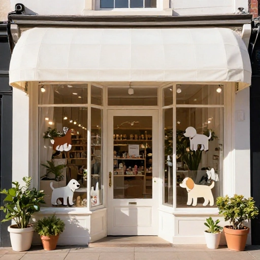
Your window is your Pinterest thumbnail. If it doesn’t make someone slow down, nothing else in the store matters.
I always put one big, bold focal point in the window instead of a dozen small products. A single oversized dog bed with a sleepy golden retriever statue on it? Way more powerful than a cluttered shelf of 40 toys.
Add one moving element — a small fan on a hanging banner, a gently turning display, warm string lights. Motion catches the eye from across the street.
2. Build a Hero Display at Nose Height (Both Yours and Theirs)
Most shoppers walk in and their eyes land around 48 to 60 inches off the floor. That’s your money zone.
I put my best-selling, highest-margin, most photogenic item right there. Not the cheapest thing. The one that makes people reach out and touch it.
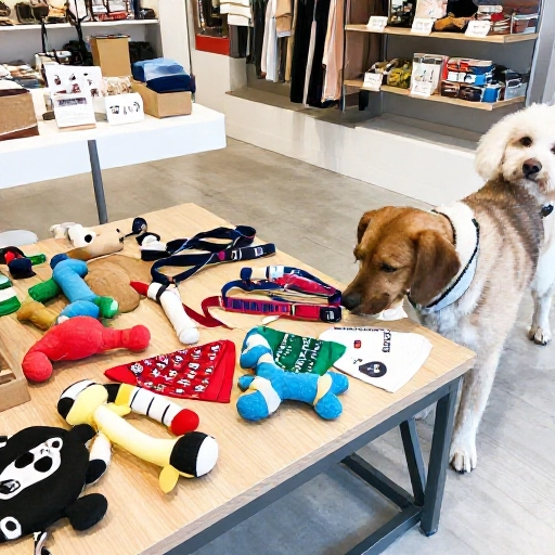
And don’t forget the second audience — pets. Low baskets of toys or a floor-level sniffing station keep dogs engaged while their humans browse. An engaged dog means a human who lingers.
3. Use Color Psychology That Actually Speaks to Pet Parents
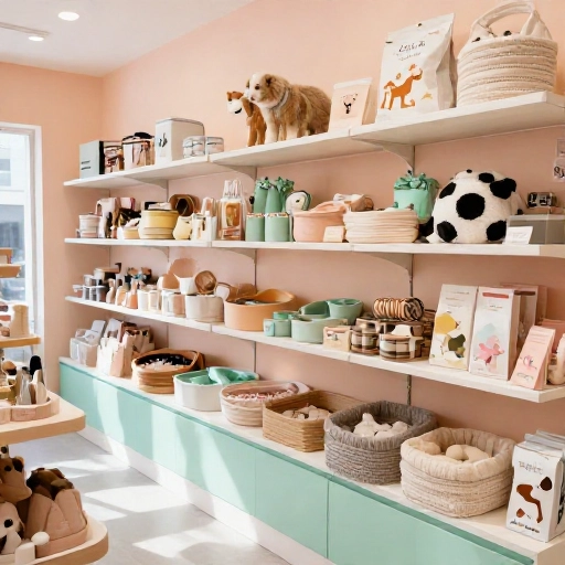
Warm neutrals plus a pop of color is the combo I come back to again and again. Cream walls, wood shelving, then one bright signature shade on your accent wall or signage.
Why it works: the neutrals make products the star, and the pop color makes your brand memorable. Choose something that shows up in your logo and your bags.
- Soft greens and blues feel calm and healthy
- Blush and clay tones feel warm and boutique-y
- A single saturated accent (coral, teal, mustard) creates energy
4. Light It Like a Jewelry Store
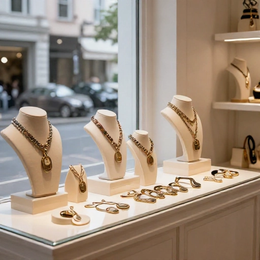
Bad lighting makes even gorgeous products look like clearance bin leftovers. Good lighting makes a $12 collar look like a gift.
I use three layers: ambient overhead light for general brightness, track or spotlights aimed right at displays, and small warm accents inside shelving. That last one is the secret — it creates depth instead of flat, fluorescent sameness.
If you can upgrade only one thing, swap harsh overheads for warm 3000K bulbs. You’ll see the difference in your photos and your sales.
5. Create One Photo-Worthy Backdrop
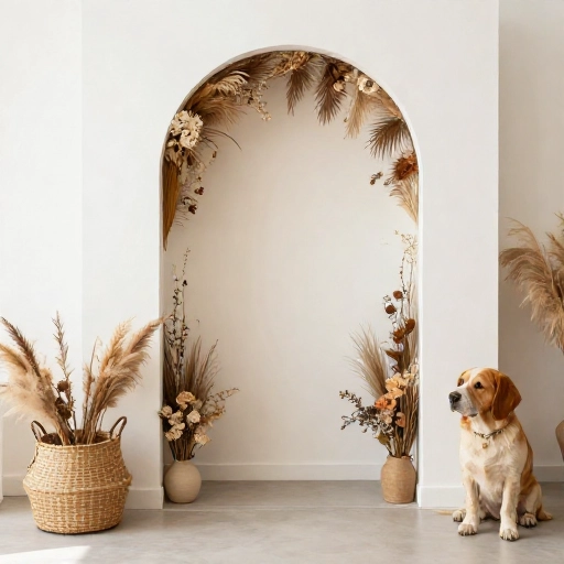
I always carve out one spot purely for photos. A textured wall, a neon sign, a cute bench with a “Good Dogs Welcome” sign above it.
Why bother? Because every person who takes a photo in your store is doing free marketing for you. And every photo on Pinterest or Instagram is a tiny billboard.
Make it easy to pose. Give it good light. Add a prop or two. Then watch how often it shows up in your tagged posts.
6. Zone Your Store by Pet Personality, Not Product Category
Instead of “toys here, food there, grooming over there,” I like to group by the kind of pet parent walking in.
The adventurer. The cozy homebody. The anxious new puppy parent. The pampered senior dog.
When you shop by personality, people find more than one thing they want on the same shelf. That’s how baskets get fuller without you ever upselling.
7. Add Height With Risers, Shelves, and Stacks
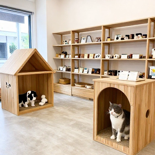
Flat displays are forgotten displays. Everything at the same level reads as a wall of sameness.
I use wooden crates, acrylic risers, and stacked books to create little hills and valleys. Tall items in back, small items in front, and a few dramatic props to break the line.
The eye naturally travels down a staircase shape. Use that to pull attention from the top shelf all the way to the basket on the floor.
8. Make Sampling Stations Irresistible
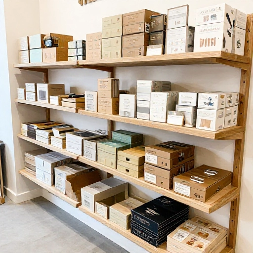
Nothing converts a curious shopper like a treat in their dog’s mouth. It’s the oldest trick in retail and it still works.
I set up a small treat station just inside the door with a labeled jar and a sign that says “Ask before treating!” It’s friendly, it’s fun, and it starts a conversation.
You can also do scent samples for shampoos, small sample bags of food, or a “try before you buy” bin for chews.
9. Choose Materials That Survive Real Dogs
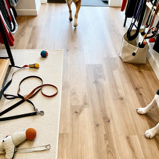
Here’s the truth nobody tells new boutique owners: your beautiful store will get peed on. Probably this week.
So skip delicate fabrics and pale carpets. I lean on sealed concrete, luxury vinyl plank, and washable rugs in darker tones.
For surfaces, matte finishes hide scratches and nose prints way better than glossy ones. And anything at tail height should be either sturdy or replaceable.
10. Build a Try-On Zone With Mirrors
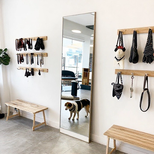
Mirrors aren’t just for clothing boutiques. Put a full-length mirror near your harness and apparel section and watch what happens.
People put the harness on their dog, look in the mirror, and suddenly the purchase feels real. It’s no longer a product — it’s a picture of their life.
Add a hook for their leash and a small bench so they can kneel down comfortably. Small comfort, big difference.
11. Write Signage That Sells, Not Just Labels
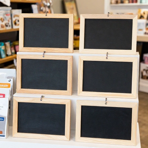
“Dog Collar — $24” tells me nothing. “The one that survived three puppies and a lake trip” tells me everything.
I write short, human signs for my top products. One sentence about why I love it. One detail about who it’s for.
Handwritten chalkboard tags or kraft paper cards feel warm and boutique. They also let you switch things up fast when seasons change.
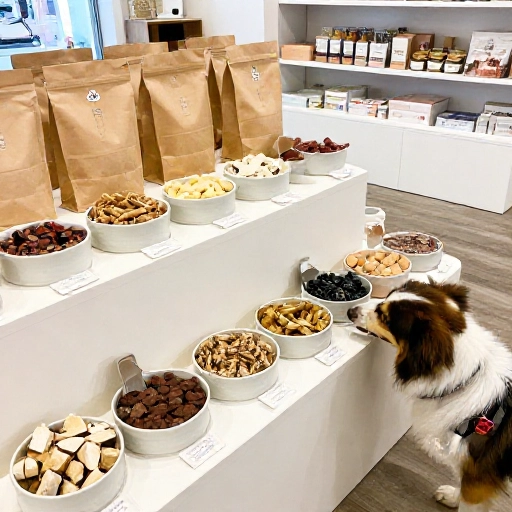
12. Put a Treat Bar Near the Back
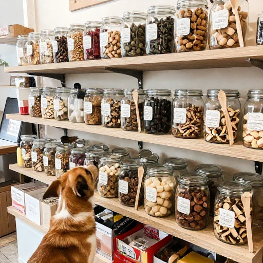
This is my favorite layout trick. Treats, chews, and bulk biscuits live at the back of the store.
Why? Because everyone walks to the back to get them — and on the way, they pass everything else. It’s a natural tour of your store.
Make the treat bar feel like a candy shop. Clear bins, scoops, kraft bags, and a sign explaining how it works.
13. Turn Checkout Into a Last-Minute Add-On Magnet
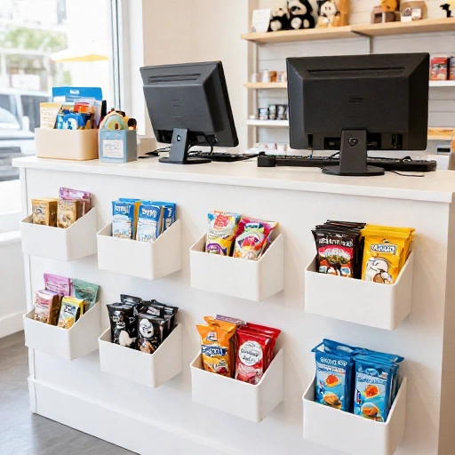
The register is where small, cheap, irresistible items live. Think $4 to $15 price points that feel like an easy yes.
- Lip balm and paw balm
- Single-ingredient treats
- Poop bag holders and clips
- Tiny bandanas and bow ties
- Greeting cards for pet parents
Keep it tidy and low. A cluttered checkout feels stressful, and stress kills impulse buys.
14. Layer Scent and Sound on Purpose
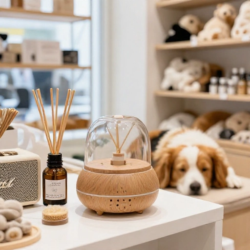
I want my store to smell like clean laundry and vanilla, never like wet dog. A subtle diffuser near the entrance does most of the work.
For sound, keep it low and warm. Soft acoustic playlists beat pop radio every time, and if a dog gets nervous, I have a quiet corner with a white noise machine.
Small sensory details like this are why people describe a good boutique as “calm.” It’s not an accident.
15. Plan for Seasonal Resets Before You Need Them
The pros don’t rebuild their stores every season — they have a flexible system ready to go.
I use movable fixtures, interchangeable sign frames, and a color palette that works year-round with just a few accent swaps. Halloween means orange props, not a whole new store.
Block out one reset day per season. Change the window, refresh the hero display, rotate the front table. That’s it. Fresh store, zero burnout.
Wrapping It Up
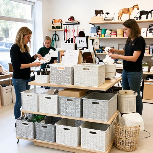
Good pet boutique design isn’t about spending a fortune. It’s about being deliberate with the space you already have.
Start with one trick from this list this week. Maybe it’s the hero display. Maybe it’s the treat station by the door. Small changes stack up fast, and your customers will feel the difference before they can name it.
And honestly? The best-designed pet boutiques are the ones where you can tell a real person picked every single thing on the shelf. That’s the part no template can copy.
Frequently Asked Questions
What’s the single most important design element in a pet boutique?
Lighting. It affects how products look, how photos turn out, and how long people want to stay. You can fix almost everything else later.
How do I design a pet boutique on a small budget?
Focus on your window, your entrance, and your checkout counter. Those three spots do the most work. Thrifted crates, painted walls, and good bulbs can transform a space for very little.
Should my pet boutique be dog-friendly for shoppers to bring their pets?
Yes, if you can manage it. Pet-friendly stores get longer visits and more repeat customers. Just set clear rules, keep water bowls handy, and have a cleanup kit behind the counter.
How often should I change my store displays?
Refresh your window every three to four weeks and do a full seasonal reset four times a year. Anything longer and regulars stop noticing what’s new.
What colors work best for a pet boutique interior?
Warm neutrals like cream, sand, and soft grey are a safe base. Then add one signature accent color that matches your brand. Too many bright colors compete with your products.